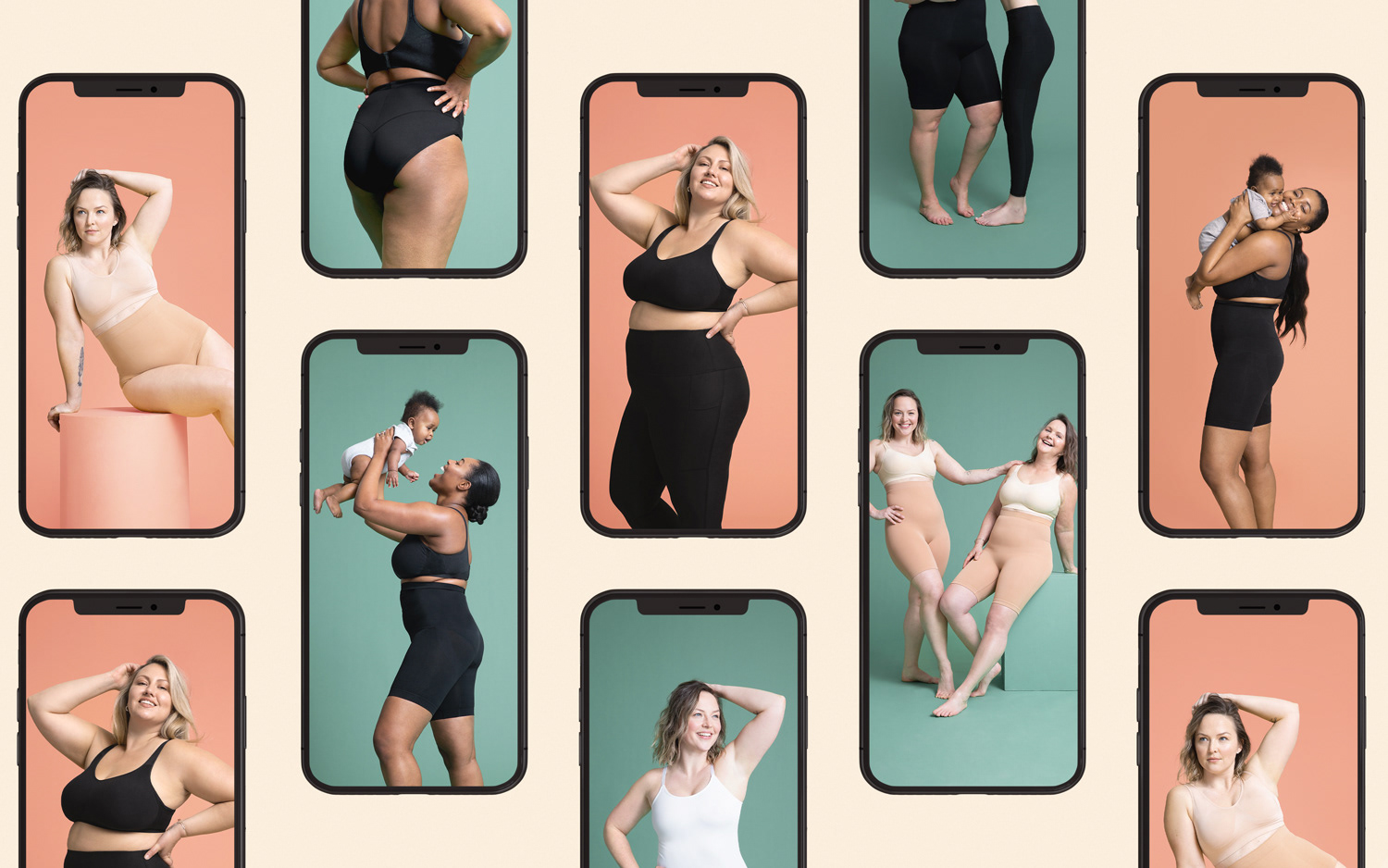

It's a brand that shape the lives of the customers by providing everyday essentials that support all body types, shapes and size.
We want to inspire confidence and embrace body positivity through our brand communication.
In shapermint we are always offering different types of sales, discounts and offers for the customers.
This project is for Mothers day Sale and I designed some assets related to this Special Date.
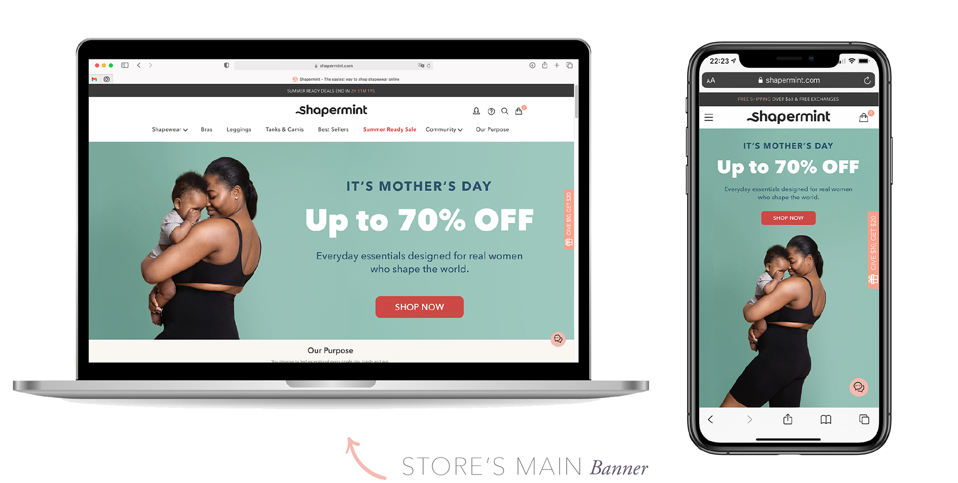
I chose the mother and daughter with a green background as the central image of the campaign and made the design on the image. I rebuilt the background with a similar gradient to give me the width size of both measurements, achieving a clean design that focused all the attention on the promotion and the CTA.
I adapted the designs in mockups both desktop and mobile for a better visualization.
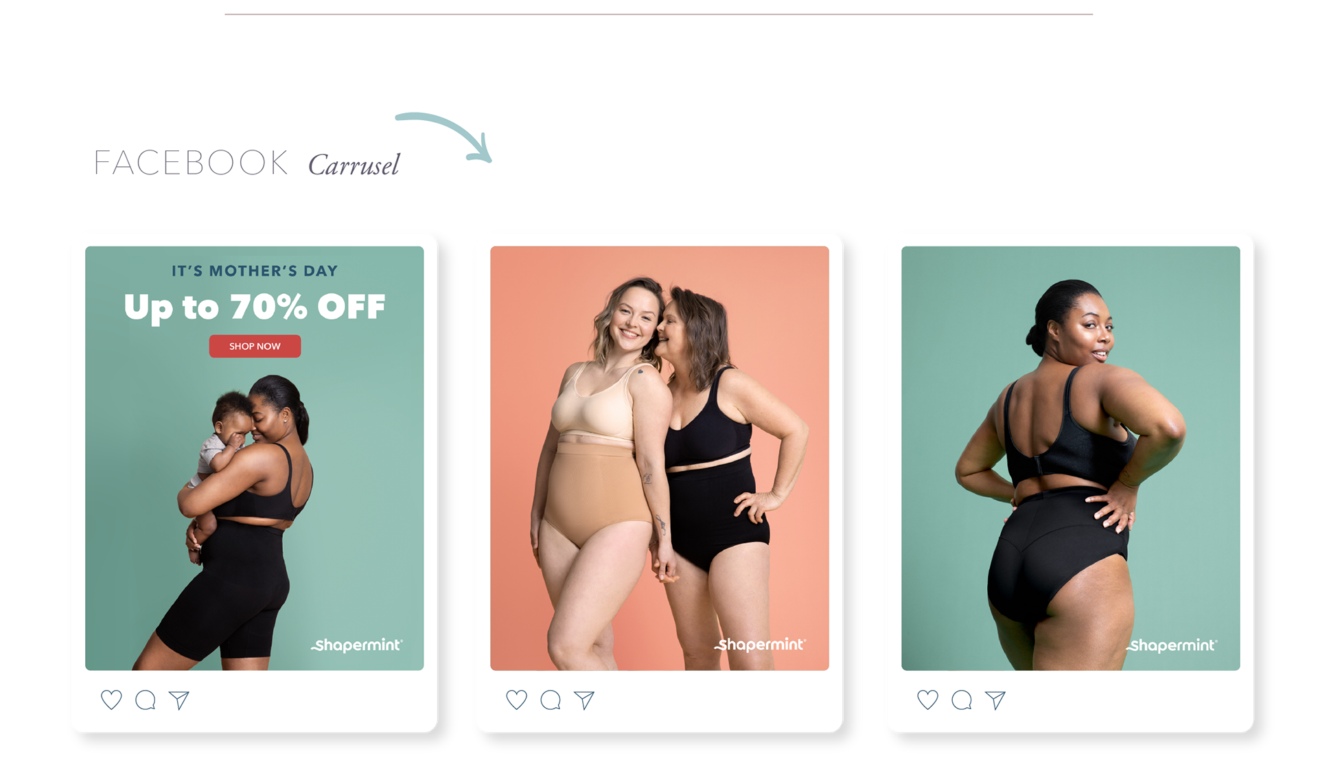
It is proven that carousels have better engagement, which is why I chose to propose this format with an initial cover of the central campaign image with the text and cta adding more campaign images next to the logo. Try to centralize it in the images that speak for themselves, because even though the rule of 20% of text in ads has been eliminated, Facebook continues to recommend the little use of text for a better performance of the campaign.
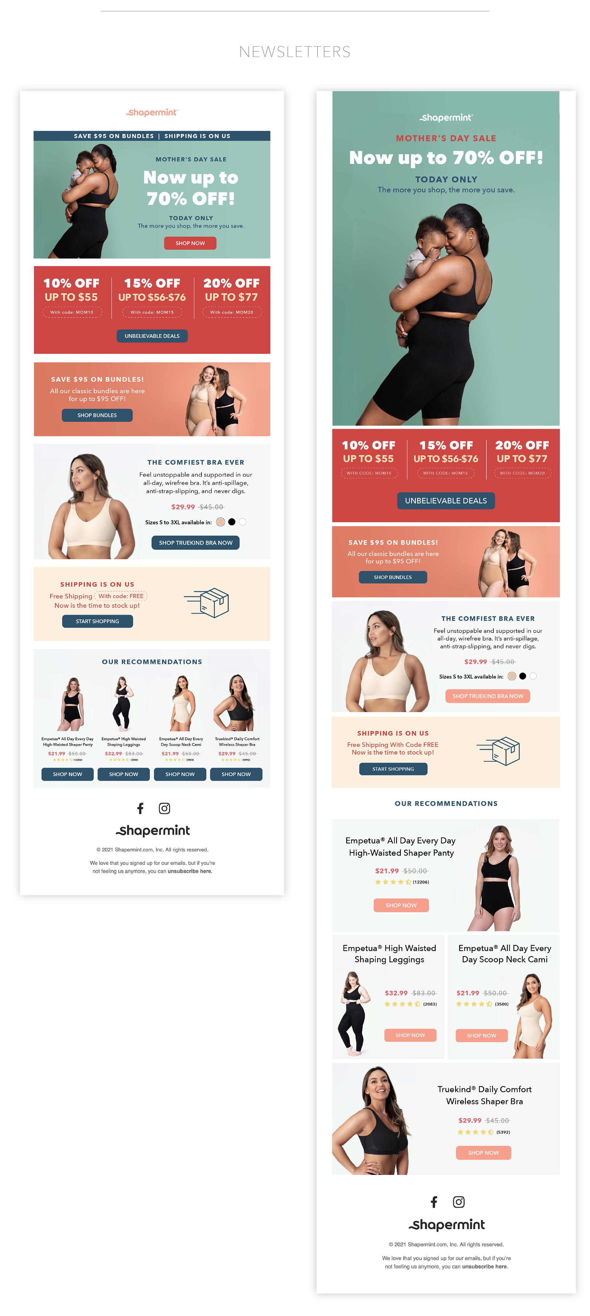
I made two design options where the main banner changes, in option 1 I made it smaller so that more information can be entered in a first screenshot, on the contrary in option 2 I focus attention on the main banner.
Another thing that is modified is the recommendations section. In option 1 all 4 appear on the same line while in option 2 they appear larger and more important.
Another thing that is modified is the recommendations section. In option 1 all 4 appear on the same line while in option 2 they appear larger and more important.
In the campaigns that allow it, I like to propose to run two options in parallel to determine which of the two designs has better engagement and take it into account for the next campaigns.